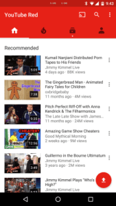
Do you also hate the new Android YouTube app layout?
Lets be clear on something from the start: I really like YouTube. I use it all the time, almost daily, and I really enjoy it because there is such a wide variety of content on there to consume.
I also really like and appreciate how the YouTube ecosystem has spawned a lot of independent channels dedicated to producing quality content. Anything from daily news, documentaries, independent movies, comedy, tutorials, advice, education… so much.

I am not a producer of YouTube content, although I have considered it, I just don”t think I have compelling enough content to provide the world using the medium of video.
However, the usability of this deep and diverse content is defined by the gateway entry points used to access it. In this context, this would of course be the actual YouTube.com website itself and the various apps for Android, iOS, Windows Phone, Blackberry, etc.
The new layout is really bad. REALLY BAD.

There is now loads of wasted space no ability to see a single view of multiple content streams, meaning that before it was easy to see a consolidated summary of Recommendations, New Videos, Channel Subscriptions, Watch it again, Unfinished watching, Recommended Channels, etc.
Each of these views could be expanded by pressing on a little arrow button at the bottom of the area/section to browse more videos WITHOUT LEAVING THE HOME VIEW. This meant I could browse through videos and recommendations, add something to ‘Watch Later’ or a playlist while seeking out something else. It made actual browsing so much more natural.

Now its a single ‘view stream’ of everything, and to make that worse the thumbnails are so large that less than 2 videos can be seen on the screen at once. It takes forever to scroll through.
To add to that, the main view is of all videos Recommended to you, with some of your existing channels. Also mixed into all this are ads, which are formatted exactly the same as videos. This last part I’ve seen as a little sneaky.
I hate this new view, and in the VERY LEAST Google should provide users with the ability to CHOOSE between this new view and the old one, like with GMails ‘Priority Inbox’.
I’m very disappointed.
What have I done about this?
Left a public comment on the YouTube blog and made my reasons clear, providing reasons of what I’ve seen a problem.
Also, I’ve rated the app down in the Google Play App Store and left feedback relating the same reasons.
I’m not the first person to do this, and I hope I’m not the last.
If you feel the same way, I would suggest you do the same, as they are not going to know otherwise.
